

Illustrations: Marta Pucci
Emotionally stunted design


Flat Minimalism. It’s the design approach that achieved mainstream appeal, as we moved away from the bubbly-glossy screen design that was dominant previously. That change was a good thing. Screen design now has the potential to be less constrained than ever before, enabled by practically pixel-free screens, but designers keep taking their aesthetic expressions towards an extreme simplicity that’s lacking in emotion. Today’s minimalistic design trend seems to strive for that, to avoid all flourishes, all emotional content, and this has left us with a landscape of sterilized and vapid mainstream products.
When was the last time you saw an app and thought, “wow, that’s beautiful!” I can think of a few, but they’re mostly games. For games, check out Loopimal, Prune, Monument Valley and Two Dots. For utilities, check out Calcbot, Fantastical 2, Slack and I’ll include my app, Clue, into the mix.
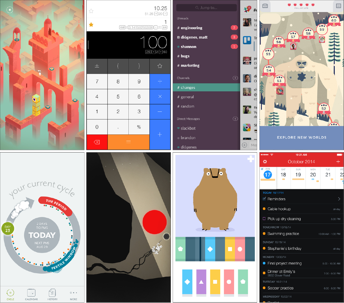
These hopefully demonstrate that it’s possible for emotional design to reach into the mainstream utilitarian products we use everyday, but there are so few. Why isn’t more of that happening?
Screen design nowadays often seems less like design and more like being a librarian for functionality, color and form.
We skate the event horizon of minimalism’s singularity, as if removing *everything, all design elements and all features, *would finally create some design nirvana. The current approach to screen design is now a well-repeated pattern. Pick a palette of muted tertiary colors, pop an extra light sans-serif white font on top of it, allow one action per screen, and it’s done.
Today’s minimalistic design is akin to taking vitamin and fiber supplements instead of eating a meal.
That might be everything you need to function as a human, but you probably don’t eat like that in everyday life. Why should we expect people to enjoy eating the everyday apps they use, if we’ve prepared them the same way?
Minimalism, yes, it’s a good thing. It’s actually a great thing for screen design, but it’s been taken too far. Today’s design styles are more like app themes that can be copy-pasted across products. If that’s true, where has the voice of the brand gone? As designers, why are we giving our communities of users that emptiness?
How did we get here?
The ‘why’ is mostly striving for simplicity and ease of use. Don Norman got it right with his advocacy for user-centered design, starting way back in 1988 (see his classic, The Design of Everyday Things). But a one-dimensional approach for perfect obviousness of utility will strip away emotion, unless the emotional component is considered as an essential part of the process. Don is a lovely guy, and he’s absolutely not on a quest to rid the world of emotion. It’s just that the lessons from cognitive science, HCI and usability too often have totalitarian-like rule over aesthetics, instead of containing or inspiring aesthetic choices.
We all hopefully make use of some nimble forms of generative and evaluative research, but when was the last time you identified emotional requirements during your generative research or used them during concept or design evaluations?
Most lean product development focuses on identifying unmet needs, then product development takes over, which probes users with iterative MVP (minimum viable products), until what’s made stops bothering them (aka “market-fit”), while still generating business value. This is most often what’s talked about regarding lean methodology for product development.
It doesn’t have to be like that, but more effort is needed for exploring and iterating emotional engagement as part of the MVP process. There’s a lot of discussion about what to do with the “V” in MVP. I’m not in favor of creating new terms, such as redefining MVP to mean Minimum Valuable Product (although I do like that.) I am instead in favor of deepening and qualifying our existing understanding of viability. In this case, “viability” would include emotional viability.
It’s a sad point if we believe our work has no requirement to connect emotionally with the people we design for. Are we really trying to fill the world with neutral, joyless creations? No. Please, no.
Hartmut Esslinger, a true legend in design and founder of frog design, coined the phrase “form follows emotion”, which is a riff off of the phrase “form follows function” from Louis Sullivan. Current screen designs are too heavily influenced by the function of Louis Sullivan’s modernist design philosophy, and not enough by the emotion of Hartmut Esslinger’s.
Clue’s own product has the potential to trigger emotional reactions — for good or bad — all over the place. We deal with topics of sexuality, identity, self-confidence and beauty. Some people are so offended by emotion in our category that they use spreadsheets to track their data. This could be a very good reason for not risking emotional engagement at all, but we choose to do it anyway.

Designing with respect to emotional content is a choice about designing for people, instead of designing at a target audience.
When Twitter switched to using a heart to indicate a “fave”, the debate cracked me up. People were upset because they were emotionally connected to a lack of emotion. The frustration was that the graphical heart suggests a specific emotion, instead of being an emotionally-neutral device, and the heart doesn’t represent the diverse ways the fave is actually used, i.e. as in bookmarking something I *don’t *like. Was emotive design the right choice in this case? That depends on a lot of things, including company and design strategy. Is it more strategically relevant for Twitter to move towards being a spreadsheet, or towards emotional engagement? If it’s the latter, did they do it right?
So, what do we do about this?
Not all products benefit from emotional designs. It’s up to the design strategists to decide which ones will. But there are far more opportunities than are being taken advantage of, which leads me to wonder if product teams talk about “design strategy” at all.
Design principles are extremely helpful, but there’s a prevalent over-use of the same, undifferentiated design principles: simple, clean and intuitive. Ugh. Design principles may be a good place to start exploring with emotion in design strategies. “Happy” is included as one of our design principles, and that was a hard-nose strategic decision based on research. It’s not a fluffy thing we chose, because we needed something to cuddle through product development.
All product people should have some raw empathetic capacity and be willing to establish genuine emotional relationships with our community of users (via their products), but not the prefab emotional content robotically generated for a target audience (aka persona, user segment, etc). You may have heard me talk about this before.
Designers should be focused on impressing the people using their products, not focused on impressing other designers.
The digital things we create are carried by millions of unique people. It might be helpful to consider that these things generate an ongoing relationship with those people, actual people. Are our teams expressing some care for those people? Are they able to talk about them on personal terms, as individuals? Clue team members who do the work of design, engineering, marketing and operations all have some basic training in generative research methods, and it’s our goal for everyone to handle a few support conversations each month that are relevant to their work. A little of this real world contact goes a long way.
If we don’t like our support conversations, we should build better products.
We should be able to identify differentiated and strategically relevant “emotional requirements” and measure if those are being met, just as we identify and test if purely functional requirements are being met.At Clue, we measure the metric of “happiness”. We’ve found that features that do not somehow trigger happiness are the ones most likely to fade into the background, because they failed to create a connection.
People are not data; they’re people. This feels controversial to say in the world of lean product development.
Every person who writes to Clue receives a personal response. These conversations sometimes span weeks. This may seem daunting for products that have tens of millions of users. The alternative is a loss of empathetic connection with a product’s community and their needs. You’ve heard this before, and it might sound like blah blah by now, but when you go searching for the next killer feature, just think of all the wasted MVP due to the lack of understanding you have about your users. Maybe the ROI seems more obvious at that point. If you’re the product lead, spending a significant amount of time to develop a personal, empathetic connection with your users is a good investment.
Collectively, we need to add room for user-love into the standard lean methodology, which seems too focused on just getting something, anything, out. Yes, speed, experimentation and iteration are valuable, but “being lean” is too often the excuse for not doing anything but the most superficial design efforts. We can afford to make early mistakes with emotional expressions in our designs, then iterate those too. This can be part of our MVP processes.
The design community is famously navel-gazing. The most interesting designs are horribly diluted in Dribble or Behance. Those are a better source of sameness.
We can spend time looking outside the app world for inspiration into what creates emotional connections with people. My favorite sources of inspiration are not screen-based, they include contemporary art, urban art and event posters. It surprises me how often product people seek inspiration from apps, and very often inside their own category of apps. If we’re seeking inspiration and differentiation, we receive greater benefit by from looking in different places for insights.
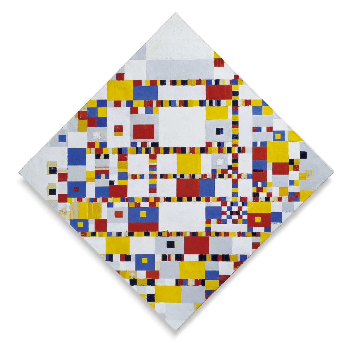
As an example, for grid layouts, there are places to look besides OS GUI guidelines or classic examples from the Swiss. How about the Dutch instead? And by that, I mean Mondrian. Those are some of the finest, flat, minimalist layouts I know of, but they still have emotion.
We designers rely heavily on text and graphics in designs. That’s mostly because they’re a part of our standard toolkit. However, illustration and photography can immediately bring emotion into design. This is why Flipboard was a breakthrough for RSS readers, by highlighting visual content, which is naturally more emotional. While stock libraries can be an easy source for illustration and photography, using them requires generalizing design content to match their inherent conceptual generalizations. Custom illustration and photography can be intimidating due to the cost or conceptual and technical processes involved, but they are extremely impactful, even when simple.
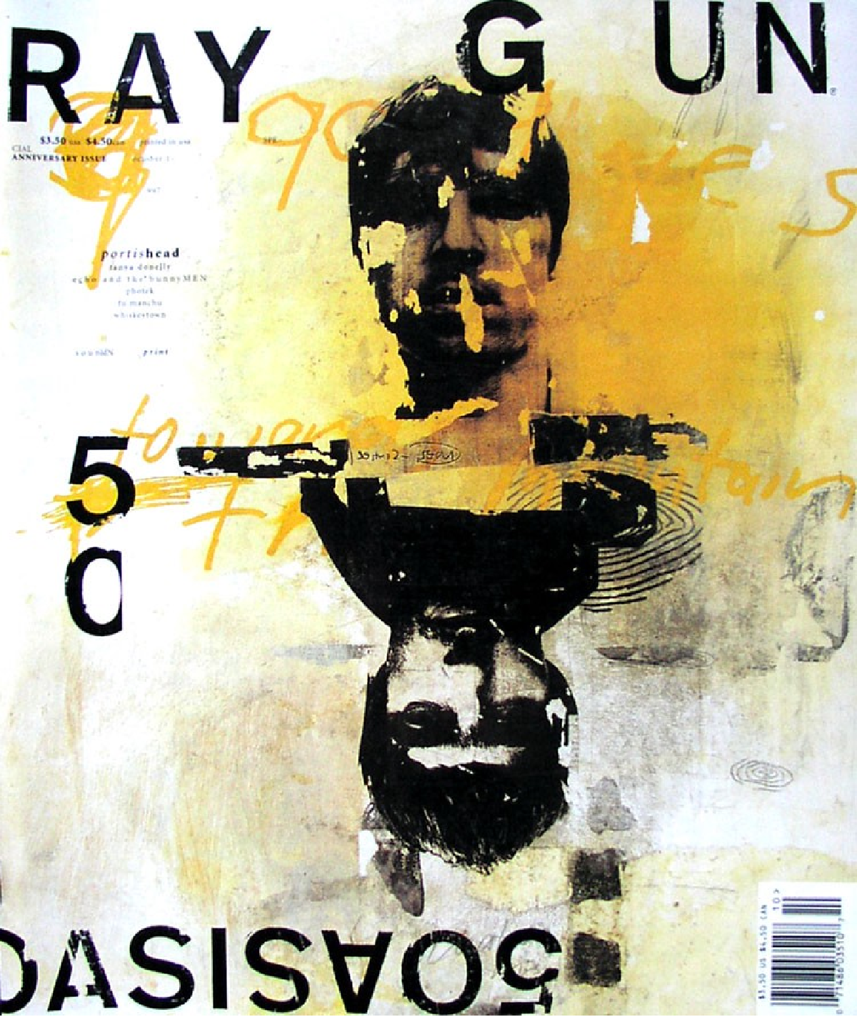
I imagine the next step in screen design could be a backlash at minimalism that moves us towards some kind of maximalism, similar to the effect (but not the style) David Carson had with the hugely influential Ray Gun magazine in the early 90s. He prepared design as meals to eat, and to smear on our walls.
But why should we do this at all? What’s the purpose, or more crassly, what’s the business value? What’s the ROI? The community your product serves probably has very different emotional needs than mine, so there’s no single answer, except to say that there is a meaningful way to tickle every persons’ emotions, if that’s done with respect and empathy. The core business value Clue gets from the emotional connection we have with our users is trust.
There is obviously a balance to strike between pure usability, pure design and business value. I’m not arguing against pure usability or for pure design as an artful expression. But anytime you find an opportunity to create an emotional connection, be it through usability or design, please do it. In the world of screens, to get love, you need to give it first.


